Additional Prediction - Risk Scoring and Clustering
Risk Scoring
Following our regression work, we decided to make our insights more actionable by developing a novel scoring method capable of indicating whether a PUMA is at relatively lower or higher risk of achieving some COVID-19-related outcome. To demonstrate the method, we developed a risk score for whether a PUMA is likely to achieve the 70% resident vaccination rate, which has been considered by many scientists (pre-delta, at least!) as the requite immunization level required for herd immunity to “halt the pandemic.” That said, our method is applicable to other outcomes as well, and one might imagine using it to score a given PUMA on the possibility of a hospitalization rate above X%, or a death rate above Y%.
The risk scoring method we developed is predicated on regularized logistic regression, used most often for classification tasks because predictions can be interpreted as class probabilities. Regularization further prevents over-fitting of the model.
First, we defined our binary outcome: 1 for below 70% vaccination, and 0 for equal to or above 70% vaccination. Then, we converted our set of predictors to matrix form.
# 1 indicates BELOW 70% vaccination rate
logistic_df = nyc_puma_summary %>%
  mutate(
    below_herd_vax = as.factor(ifelse(covid_vax_rate >= 70, 0, 1))
  ) %>%
  select(-puma, -total_people, -covid_hosp_rate, -covid_death_rate, -covid_vax_rate)

# Define predictors matrix
x = model.matrix(below_herd_vax ~ ., logistic_df)[,-1]

# Define outcomes
y = logistic_df$below_herd_vax
We proceeded to train a glmnet lasso model on our training data using 5-fold cross-validation repeated 100 times given the large number of predictors compared to our mere 55 PUMA samples, and because we were interested in predicting the risk score of vaccination rate for each PUMA in our data set:
set.seed(777)
vax_cv <- trainControl(method = "repeatedcv", number = 5, repeats = 100,
                       savePredictions = T
                       )

# Goal is to find optimal lambda
lasso_model <- train(below_herd_vax ~ ., data = logistic_df,
                     method = "glmnet",
                     trControl = vax_cv,
                     tuneGrid = expand.grid(
                       .alpha = 1,
                       .lambda = seq(0.0001, 1, length = 100)),
                     family = "binomial")
Through our lasso regression, we found an optimal lambda tuning parameter of 0.0102, and generated a model prediction accuracy of 0.886 (~89%). Generally, however, obtaining the kappa value averaged over the simulated confusion matrices is a more useful metric for prediction given unbalanced classes (of our 55 PUMAs, only 14 actually achieved vaccination rate >= 70% at time of data entry, while 41 did not).
Confusion Matrix
coef <- coef(lasso_model$finalModel, lasso_model$bestTune$lambda)

sub_lasso <-
  subset(lasso_model$pred, lasso_model$pred$lambda == lasso_model$bestTune$lambda)

# Use function for better visualization of confusion matrix
# Credit to https://stackoverflow.com/questions/23891140/r-how-to-visualize-confusion-matrix-using-the-caret-package/42940553

draw_confusion_matrix <- function(cm) {

  layout(matrix(c(1,1,2)))
  par(mar=c(2,2,2,2))
  plot(c(100, 345), c(300, 450), type = "n", xlab="", ylab="", xaxt='n', yaxt='n')
  title('55 PUMAs Across 100 Simulations (n=5500)', cex.main=2)

  # create the matrix
  rect(150, 430, 240, 370, col='#fde725')
  text(195, 435, 'Above 70% Vax', cex=1.2)
  rect(250, 430, 340, 370, col='#440154')
  text(295, 435, 'Below 70% Vax', cex=1.2)
  text(125, 370, 'Predicted', cex=1.3, srt=90, font=2)
  text(245, 450, 'Actual', cex=1.3, font=2)
  rect(150, 305, 240, 365, col='#440154')
  rect(250, 305, 340, 365, col='#fde725')
  text(140, 400, 'Above 70% Vax', cex=1.2, srt=90)
  text(140, 335, 'Below 70% Vax', cex=1.2, srt=90)

  # add in the cm results
  res <- as.numeric(cm$table)
  text(195, 400, res[1], cex=1.6, font=2, col='black')
  text(195, 335, res[2], cex=1.6, font=2, col='white')
  text(295, 400, res[3], cex=1.6, font=2, col='white')
  text(295, 335, res[4], cex=1.6, font=2, col='black')

  # add in the specifics
  plot(c(100, 0), c(100, 0), type = "n", xlab="", ylab="", main = "DETAILS", xaxt='n', yaxt='n')
  text(10, 85, names(cm$byClass[1]), cex=1.2, font=2)
  text(10, 70, round(as.numeric(cm$byClass[1]), 3), cex=1.2)
  text(30, 85, names(cm$byClass[2]), cex=1.2, font=2)
  text(30, 70, round(as.numeric(cm$byClass[2]), 3), cex=1.2)
  text(50, 85, names(cm$byClass[5]), cex=1.2, font=2)
  text(50, 70, round(as.numeric(cm$byClass[5]), 3), cex=1.2)
  text(70, 85, names(cm$byClass[6]), cex=1.2, font=2)
  text(70, 70, round(as.numeric(cm$byClass[6]), 3), cex=1.2)
  text(90, 85, names(cm$byClass[7]), cex=1.2, font=2)
  text(90, 70, round(as.numeric(cm$byClass[7]), 3), cex=1.2)

  # add in the accuracy information
  text(30, 35, names(cm$overall[1]), cex=1.5, font=2)
  text(30, 20, round(as.numeric(cm$overall[1]), 3), cex=1.4)
  text(70, 35, names(cm$overall[2]), cex=1.5, font=2)
  text(70, 20, round(as.numeric(cm$overall[2]), 3), cex=1.4)
}

cm = caret::confusionMatrix(table(sub_lasso$pred, sub_lasso$obs))

draw_confusion_matrix(cm)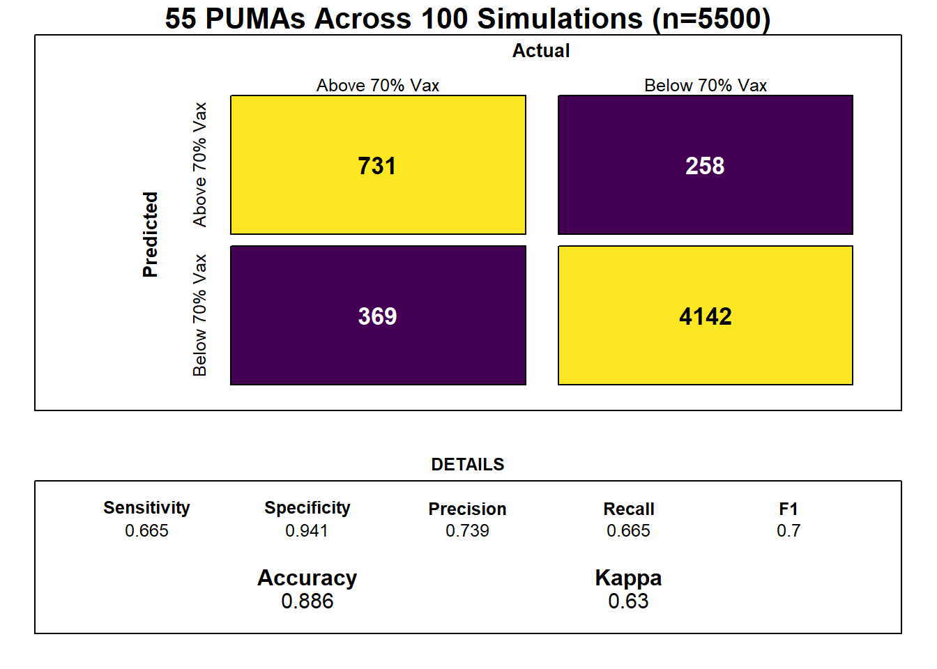
Our optimal model’s averaged kappa was 0.63, which is considered reasonably decent, or “moderate,”, but again suggests that the limited number of in-sample data points may result in model over-fitting.
Feature Selection
Notably, feature selection from our lasso regression discovered that the most important predictors of risk for sub-70% vaccination were insurance composition, employment composition, poverty composition, and welfare composition in a given PUMA – largely aligned with key correlates of vaccination noted in our exploratory analysis.
# Set grid for lambda values
lambda  <- seq(0.0001, 1, length = 100)

# Select best lambda
lambda_opt = lasso_model$bestTune$lambda

# Plot coefficient estimates as lambda varies
result_plot <- broom::tidy(lasso_model$finalModel) %>%
  select(term, lambda, estimate) %>%
  complete(term, lambda, fill = list(estimate = 0) ) %>%
  filter(term != "(Intercept)") %>%
  ggplot(aes(x = log(lambda, 10), y = estimate, group = term, color = term)) +
  geom_path() +
  geom_vline(xintercept = log(lambda_opt, 10), color = "blue", size = 1.2) +
  theme(legend.position = "none") +
  labs(y = "Coefficient Estimate", title = "Coefficient Estimates for Varying Values of Lambda")

result_plot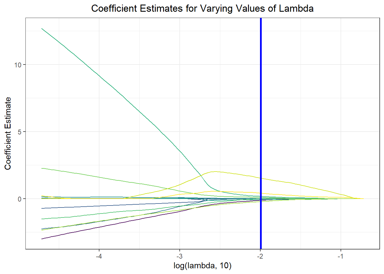
Risk Score Prediction
Again, we wanted to move beyond binary classification to develop a risk score. Generally, in logistic regression, when a data point is predicted with probability > 0.5 to be a “1,” the model classifies it as a 1, and otherwise as a 0. We obtained risk scores not only by classifying PUMAs as above or below 70% vaccination rate using our prediction model, but by obtaining the exact probability of a given data point being a 1. For instance, if a PUMA has an 85% chance of being below 70% vaccination rate according to our classifier, its risk score would be 85, even though our model would binarily predict it to be a “1” rather than a “0.”
# Finalize risk predictions
lambda <- lasso_model$bestTune$lambda
lasso_fit = glmnet(x, y, lambda = lambda, family = "binomial")
risk_predictions = (round((predict(lasso_fit, x, type = "response"))*100, 1))

puma <- nyc_puma_summary %>%
  select(puma)

vax <- logistic_df %>%
  select(below_herd_vax)

# Bind predictions and actuals for graphing / risk scores
risk_prediction <-
  bind_cols(puma, vax, as.vector(risk_predictions)) %>%
  rename(risk_prediciton = ...3)

# Plot risk predictions
risk_prediction %>%
  mutate(puma = fct_reorder(puma, risk_prediciton, .desc = TRUE)) %>%
  ggplot(aes(x = puma, y = risk_prediciton, fill = below_herd_vax)) +
  geom_bar(stat  = "identity") +
  geom_hline(yintercept = 50, linetype = "dashed", color = "red") +
  theme(axis.text.x = element_text(angle = 90, vjust = 0.5, hjust = 1)) +
  labs(title = "Predicting Risk Score of Vaccination Rate across PUMA",
       x = "PUMA", y = "Predicted Risk Score", fill = "Actual Vax Status") +
  scale_fill_viridis(discrete = TRUE, labels = c("Above 70%", "Below 70%"))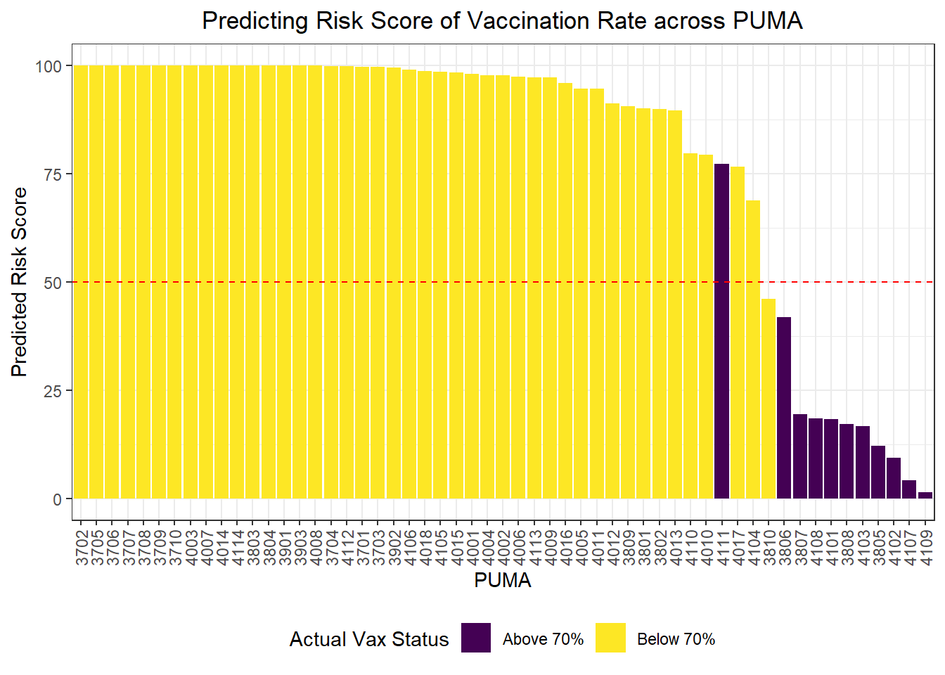
Clustering
We were also curious how statistical learning techniques would cluster our PUMAs based on predictors, and how those clusters might correspond to performance on key outcomes. We separated our data into a tibble of predictors only and a tibble of outcomes only, then fit three clusters on our predictors alone. We proceeded to plot each PUMA on hospitalization rate vs vaccination rate (choosing to forego death rate, in this case, given its collinearity and likely redundancy of hospitalization rate), then colored each data point by predicted clustering.
# Define tibble of predictors only
predictors = nyc_puma_summary %>%
  select(-puma, -total_people, -covid_hosp_rate, -covid_vax_rate, -covid_death_rate)

# Define tibble of outcomes only
outcomes = nyc_puma_summary %>%
  select(covid_hosp_rate, covid_death_rate, covid_vax_rate)

# Define tibble of pumas only
pumas = nyc_puma_summary %>%
  select(puma)

# Fit 3 clusters on predictors
kmeans_fit =
  kmeans(x = predictors, centers = 3)

# Add clusters to data frame of predictors and bind with PUMA and outcomes data
predictors =
  broom::augment(kmeans_fit, predictors)

# Bind columns
full_df = cbind(pumas, outcomes, predictors)

# Summary df
summary_df = full_df %>%
  group_by(.cluster) %>%
  summarize(
    median_hosp = median(covid_hosp_rate),
    median_death = median(covid_death_rate),
    median_vax = median(covid_vax_rate)
  )

# Plot predictor clusters against outcomes
# Example: try hospitalization vs vaccination
ggplot(data = full_df, aes(x = covid_hosp_rate, y = covid_vax_rate, color = .cluster)) +
  geom_point() +
  geom_point(data = summary_df, aes(x = median_hosp, y = median_vax), color = "black", size = 4) +
  geom_point(data = summary_df, aes(x = median_hosp, y = median_vax, color = .cluster), size = 2.75) +
  labs(x = "COVID Hospitalization Rate", y = "COVID Vaccination Rate", title = "COVID Hospitalization vs Vaccination Rates for each PUMA", color = "Cluster")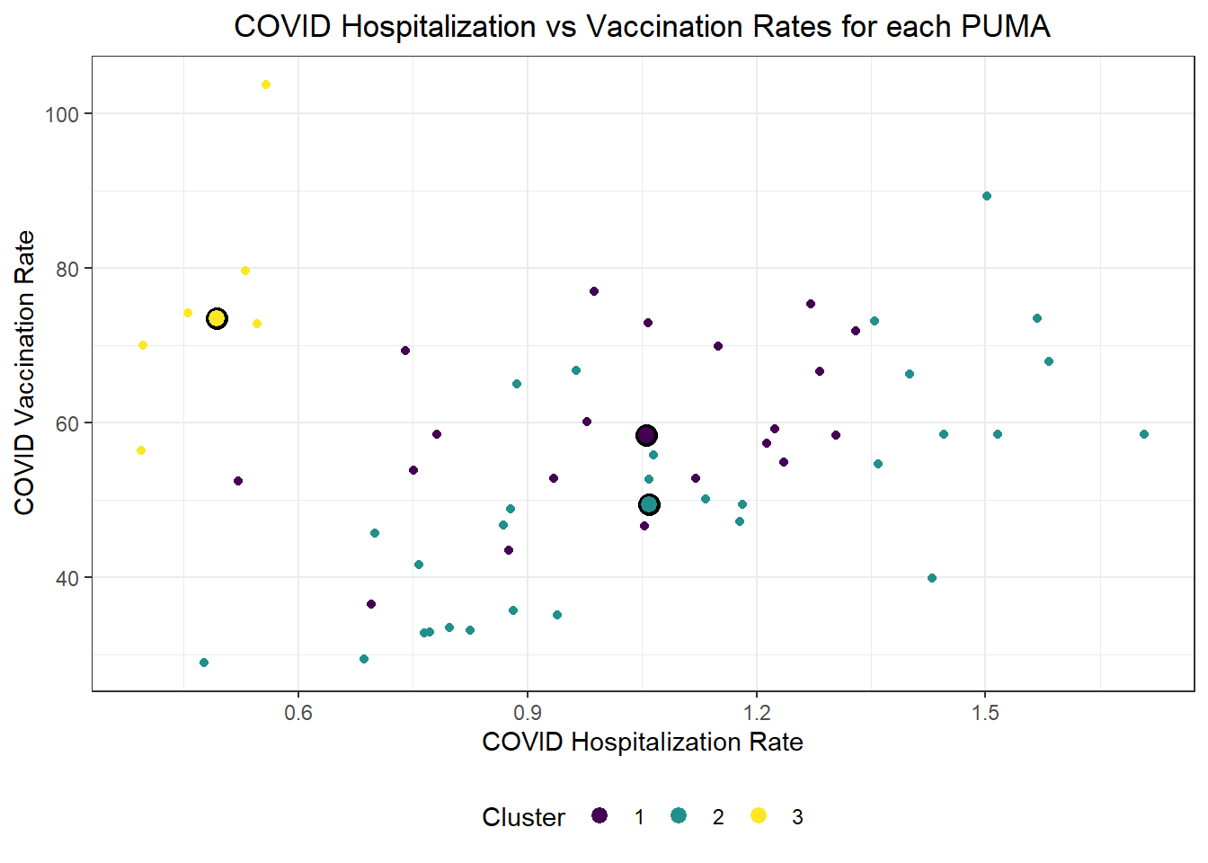
Generally, our three clusters included:
- One cluster with relatively low hospitalization rate (~5%) and relatively high vaccination rate (~75%)
- Two clusters with relatively identical average hospitalization rate (~10%), but one with substantially higher vaccination rate (nearly 60%) than the other (nearly 50%)
For fun, we also evaluated Euclidean distance between our observed PUMAs, and alternatively mapped PUMAs onto their respective clusters after reducing our predictors to two key (principal) component dimensions.
# Scale predictors
for_clustering = predictors %>%
  select(-.cluster) %>%
  na.omit() %>%
  scale()

# Evaluate Euclidean distances between observations
distance = get_dist(for_clustering)
fviz_dist(distance, gradient = list(low = "#00AFBB", mid = "white", high = "#FC4E07"))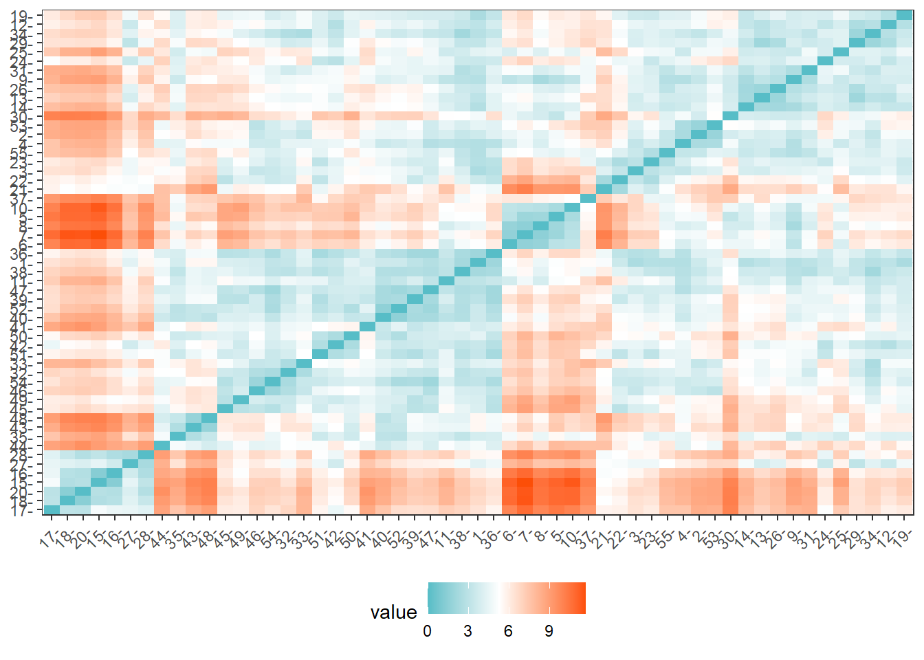
# Cluster with three centers
k_scaled = kmeans(for_clustering, centers = 3)

# Visualize cluster plot with reduction to two dimensions
fviz_cluster(k_scaled, data = for_clustering, palette = "Set2")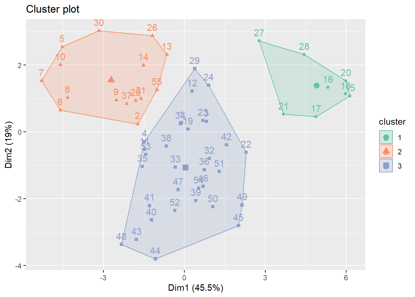
# Bind with outcomes and color clusters
full_df = for_clustering %>%
  as_tibble() %>%
  cbind(outcomes, pumas) %>%
  mutate(
    cluster = k_scaled$cluster
  )
Because we settled on setting the number of clusters at three relatively arbitrarily, we decided to evaluate the clustering quality using both WSS, silhouette, and gap methods.
# Check where elbow occurs using WSS method
fviz_nbclust(for_clustering, kmeans, method = "wss") +
  theme_bw()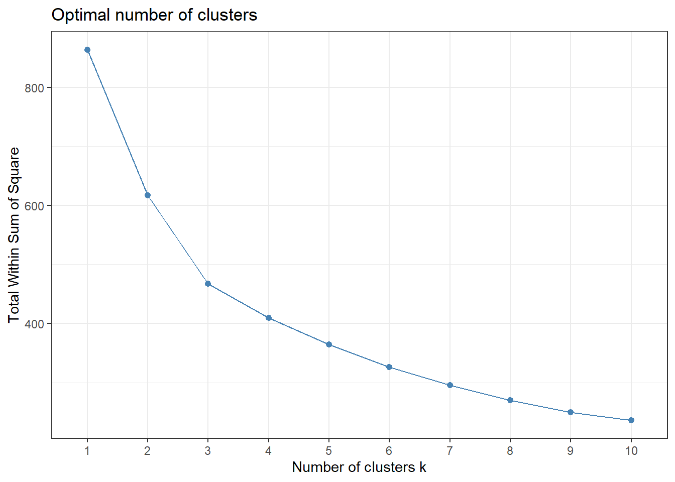
# Check for optimal number of clusters using silhouette method
fviz_nbclust(for_clustering, kmeans, method = "silhouette") +
  theme_bw()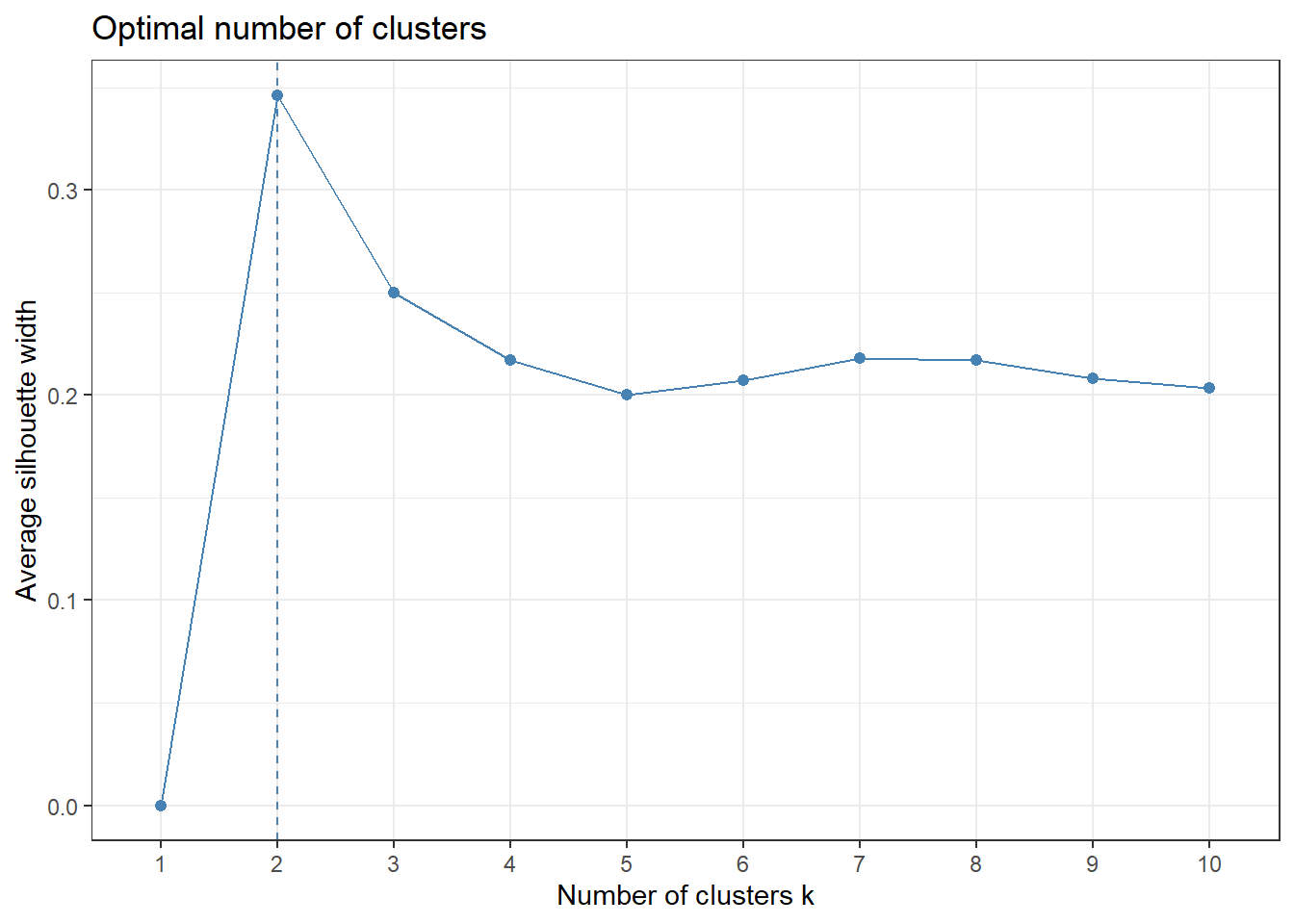
# Check number of clusters that minimize gap statistic
gap_stat = clusGap(for_clustering, FUN = kmeans, nstart = 25, K.max = 20, B = 50)

fviz_gap_stat(gap_stat) +
  theme_bw()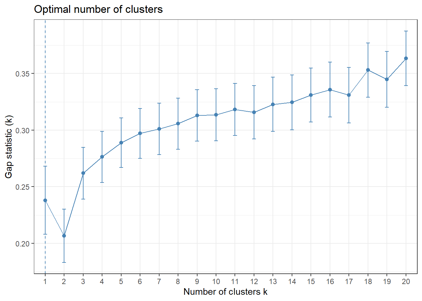
The elbow in our WSS plot indicates that three clusters may be optimal, whereas the silhouette plot shows an average silhouette width optimized at two clusters. Finally, the gap plot shows that clustering is actually optimized when the number of clusters equals 1 – i.e. when no clustering occurs. The relative lack of concordance between these assessments of clustering quality is no surprise given the fact that our model is fit on only 55 predictors. For completeness, we re-modeled our clustering of predictors with only k = 2 clusters, and again tried to visualize where these clusters of PUMAs were distributed on the hospitalization/vaccination rate axes:
# Scale predictors
for_clustering = predictors %>%
  select(-.cluster) %>%
  na.omit() %>%
  scale()

# Evaluate Euclidean distances between observations
distance = get_dist(for_clustering)
fviz_dist(distance, gradient = list(low = "#00AFBB", mid = "white", high = "#FC4E07"))
# Cluster with two centers
k_scaled2 = kmeans(for_clustering, centers = 2)

# Visualize cluster plot with reduction to two dimensions
fviz_cluster(k_scaled2, data = for_clustering, palette = "Set2")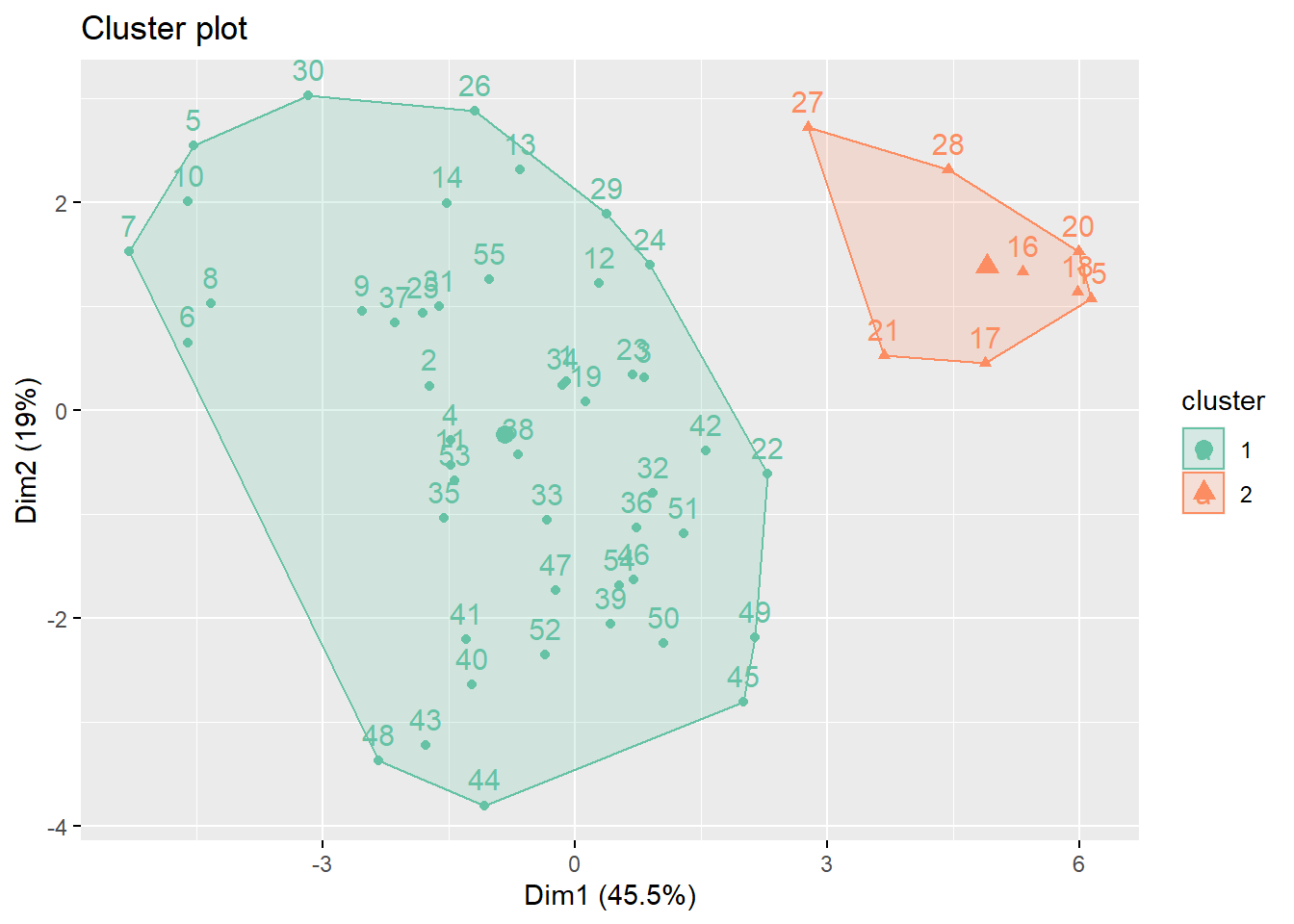
# Bind with outcomes and color clusters
full_df = for_clustering %>%
  as_tibble() %>%
  cbind(outcomes, pumas) %>%
  mutate(
    cluster = k_scaled2$cluster
  )
With two clusters, our low hospitalization/high vaccination cluster remains, but our two mid-level hospitalization rate clusters are condensed into one cluster.