Exploratory Analysis
jimzip <- function(csv_file, path) {
  # create full path to csv file
  full_csv <- paste0(path, "/", csv_file)
  # append ".zip" to csv file
  zip_file <- paste0(full_csv, ".zip")
  # unzip file
  unzip(zip_file)
  # read csv
  data_extract <- read_csv(csv_file)
  # be sure to remove file once unzipped (it will live in working directory)
  on.exit(file.remove(csv_file))
  # output data
  data_extract
}

# Apply function to filtered census data CSV
census_data <- jimzip("census_filtered.csv", "./data")
# Read in PUMA outcomes data
health_data <-
read_csv("./data/outcome_puma.csv")
# Merge census data with PUMA outcomes data
merged_data <- merge(census_data, health_data, by = "puma")
# Deprecate census data alone
rm(census_data)# Clean the merged census and outcomes data
# Each row represents one
cleaned_data =
merged_data %>%
# Remove variables less useful for analysis or redundant (high probability of collinearity with remaining variables)
select(-serial, -cluster, -strata, -multyear, -ancestr1, -ancestr2, -labforce, -occ, -ind, -incwage, -occscore, -pwpuma00, -ftotinc, -hcovpub) %>%
# Remove duplicate rows, if any
distinct() %>%
# Rename variables
rename(
borough = countyfip,
has_broadband = cihispeed,
birthplace = bpl,
education = educd,
employment = empstat,
personal_income = inctot,
work_transport = tranwork,
household_income = hhincome,
on_foodstamps = foodstmp,
family_size = famsize,
num_children = nchild,
US_citizen = citizen,
puma_vacc_rate = puma_vacc_per,
on_welfare = incwelfr,
poverty_threshold = poverty
) %>%
# Recode variables according to data dictionary
mutate(
# Researched mapping for county
borough = recode(
borough,
"5" = "Bronx",
"47" = "Brooklyn",
"61" = "Manhattan",
"81" = "Queens",
"85" = "Staten Island"
),
rent = ifelse(
rent == 9999, 0,
rent
),
household_income = ifelse(
household_income %in% c(9999998,9999999), NA,
household_income
),
on_foodstamps = recode(
on_foodstamps,
"1" = "No",
"2" = "Yes"
),
has_broadband = case_when(
has_broadband == "20" ~ "No",
has_broadband != "20" ~ "Yes"
),
sex = recode(
sex,
"1" = "Male",
"2" = "Female"
),
# Collapse Hispanic observation into race observation
race = case_when(
race == "1" ~ "White",
race == "2" ~ "Black",
race == "3" ~ "American Indian",
race %in% c(4,5,6) ~ "Asian and Pacific Islander",
race == 7 & hispan %in% c(1,2,3,4) ~ "Hispanic",
race == 7 & hispan %in% c(0,9) ~ "Other",
race %in% c(8,9) ~ "2+ races"
),
birthplace = case_when(
birthplace %in% 1:120 ~"US",
birthplace %in% 121:950 ~ "Non-US",
birthplace == 999 ~"Unknown"
),
US_citizen = case_when(
US_citizen %in% c(1,2) ~ "Yes",
US_citizen %in% 3:8 ~"No",
US_citizen %in% c(0,9) ~ "Unknown"
),
# Chose languages based on highest frequency observed
language = case_when(
language == "1" ~ "English",
language == "12" ~ "Spanish",
language == "43" ~ "Chinese",
language == "0" ~ "Unknown",
language == "31" ~ "Hindi",
!language %in% c(1,12,43,0,31) ~ "Other"
),
# Collapse multiple health insurance variables into single variable
health_insurance = case_when(
hcovany == 1 ~ "None",
hcovany == 2 & hcovpriv == 2 ~ "Private",
hcovany == 2 & hcovpriv == 1 ~ "Public"
),
education = case_when(
education %in% 2:61 ~ "Less Than HS Graduate",
education %in% 62:64 ~ "HS Graduate",
education %in% 65:100 ~ "Some College",
education %in% 110:113 ~ "Some College",
education == 101 ~ "Bachelor's Degree",
education %in% 114:116 ~ "Post-Graduate Degree",
education %in% c(0,1,999) ~ "Unknown"
),
employment = case_when(
employment %in% c(0,3) ~ "Not in labor force",
employment == 1 ~ "Employed",
employment == 2 ~ "Unemployed"
),
personal_income = ifelse(
personal_income %in% c(9999998,9999999), NA,
personal_income
),
household_income = ifelse(
household_income %in% c(9999998,9999999), NA,
household_income
),
on_welfare = case_when(
on_welfare > 0 ~ "Yes",
on_welfare == 0 ~ "No"
),
poverty_threshold = case_when(
poverty_threshold >= 100 ~ "Above",
poverty_threshold < 100 ~ "Below"
),
work_transport = case_when(
work_transport %in% c(31:37, 39) ~ "Public Transit",
work_transport %in% c(10:20, 38) ~ "Private Vehicle",
work_transport == 50 ~ "Bicycle",
work_transport == 60 ~ "Walking",
work_transport == 80 ~ "Worked From Home",
work_transport %in% c(0, 70) ~ "Other"
)
) %>%
# Eliminate columns no longer needed after transformation
select(-hispan, -hcovany, -hcovpriv) %>%
# Relocate new columns
relocate(health_insurance, .before = personal_income) %>%
relocate(poverty_threshold, .before = work_transport) %>%
relocate(on_welfare, .before = poverty_threshold) %>%
relocate(perwt, .before = hhwt) %>%
# Create factor variables where applicable
mutate(across(.cols = c(puma, borough, on_foodstamps, has_broadband, sex, race, birthplace, US_citizen, language, health_insurance, education, employment, on_welfare, poverty_threshold, work_transport), as.factor))On this page, we’ll explore overall trends for our key outcomes – hospitalizations, deaths, and vaccinations – across PUMAs and boroughs in New York City, as well as high-level trends for how these outcomes correlate with census predictors, including major demographic variables like age, race, and sex.
Overview of Outcome Variables
Outcomes by PUMA
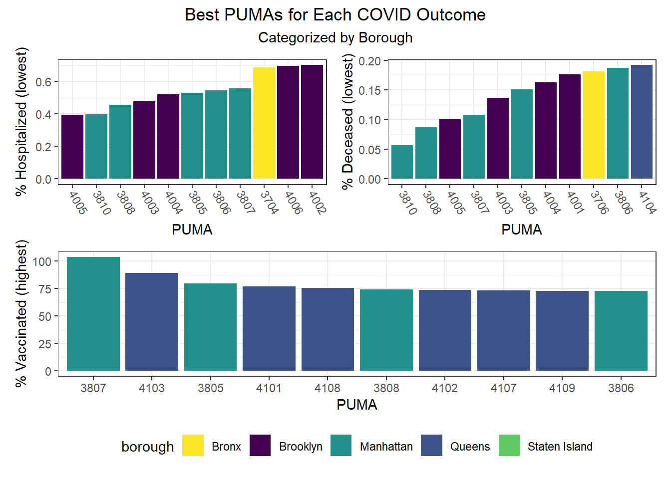
We can observe that hospitalization rates from as low as ~0.4% to nearly 2% (a 5x difference) by PUMA (see NYC Map of PUMAs and Community Districts), death rates range from just over 0.05% all the way to above 0.6% (a 12x difference!), and vaccination rates range from as low as ~30% to above 100% in one PUMA (as an artifact of migration between PUMA – a known issue in NYC DOHMH data). Excluding this vaccination outlier, the PUMAs with higher vaccination rates tend to have 75-85% of their residents vaccinated.
# Hospitalization rates across PUMAs, colored by borough
puma_level_data  %>%
  mutate(puma = fct_reorder(puma, covid_hosp_rate)) %>%
  mutate(text_label = str_c("PUMA: ", puma,
                            "\n% Hospitalization: ", covid_hosp_rate)) %>%
  plot_ly(y = ~covid_hosp_rate,
          x = ~puma,
          color = ~borough,
          width = 900,
          height = 600,
          type = "scatter",
          mode = "markers",
          colors = "viridis",
          text = ~ text_label) %>%
  config(scrollZoom = FALSE,
         displayModeBar = TRUE) %>%
  layout(plot_bgcolor = '#e5ecf6',
          title = "Hospitalization rates across PUMAs",
          xaxis = list(
            title = "PUMA",
            tickangle = 60,
            zerolinecolor = '#ffff',
            zerolinewidth = 2,
            gridcolor = 'ffff',
            autotick = F),
          yaxis = list(
            title = "% Hospitalized",
            zerolinecolor = '#ffff',
            zerolinewidth = 2,
            gridcolor = 'ffff'),
         legend = list(title = list(text = 'Borough')))
# Death rates across PUMAs, colored by borough
puma_level_data %>%
mutate(puma = fct_reorder(puma, covid_death_rate)) %>%
mutate(text_label = str_c("PUMA: ", puma,
"\n% Death: ", covid_death_rate)) %>%
plot_ly(y = ~covid_death_rate,
x = ~puma,
color = ~borough,
width = 900,
height = 600,
type = "scatter",
mode = "markers",
colors = "viridis",
text = ~ text_label) %>%
config(scrollZoom = FALSE,
displayModeBar = TRUE) %>%
layout(plot_bgcolor = '#e5ecf6',
title = "Death rates across PUMAs",
xaxis = list(
title = "PUMA",
tickangle = 60,
zerolinecolor = '#ffff',
zerolinewidth = 2,
gridcolor = 'ffff',
autotick = F),
yaxis = list(
title = "% Death",
zerolinecolor = '#ffff',
zerolinewidth = 2,
gridcolor = 'ffff'),
legend = list(title = list(text = 'Borough')))# Vax rates across PUMAs, colored by borough
puma_level_data %>%
mutate(puma = fct_reorder(puma, covid_vax_rate)) %>%
mutate(text_label = str_c("PUMA: ", puma,
"\n% Vaccinated: ", covid_vax_rate)) %>%
plot_ly(y = ~covid_vax_rate,
x = ~puma,
color = ~borough,
width = 900,
height = 600,
type = "scatter",
mode = "markers",
colors = "viridis",
text = ~ text_label) %>%
config(scrollZoom = FALSE,
displayModeBar = TRUE) %>%
layout(plot_bgcolor = '#e5ecf6',
title = "Vaccination rates across PUMAs",
xaxis = list(
title = "PUMA",
tickangle = 60,
zerolinecolor = '#ffff',
zerolinewidth = 2,
gridcolor = 'ffff',
autotick = F),
yaxis = list(
title = "% Death",
zerolinecolor = '#ffff',
zerolinewidth = 2,
gridcolor = 'ffff'),
legend = list(title = list(text = 'Borough')))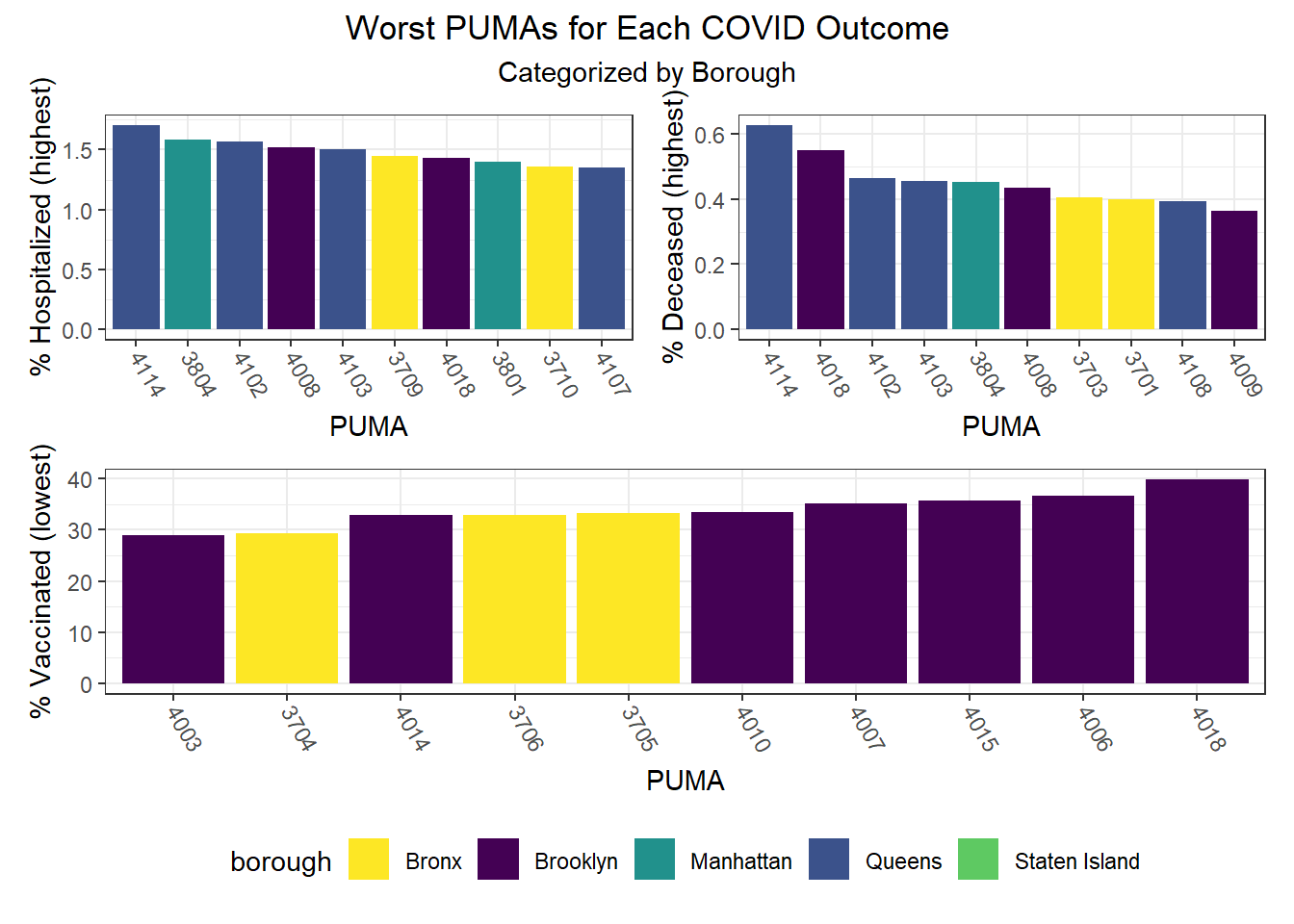
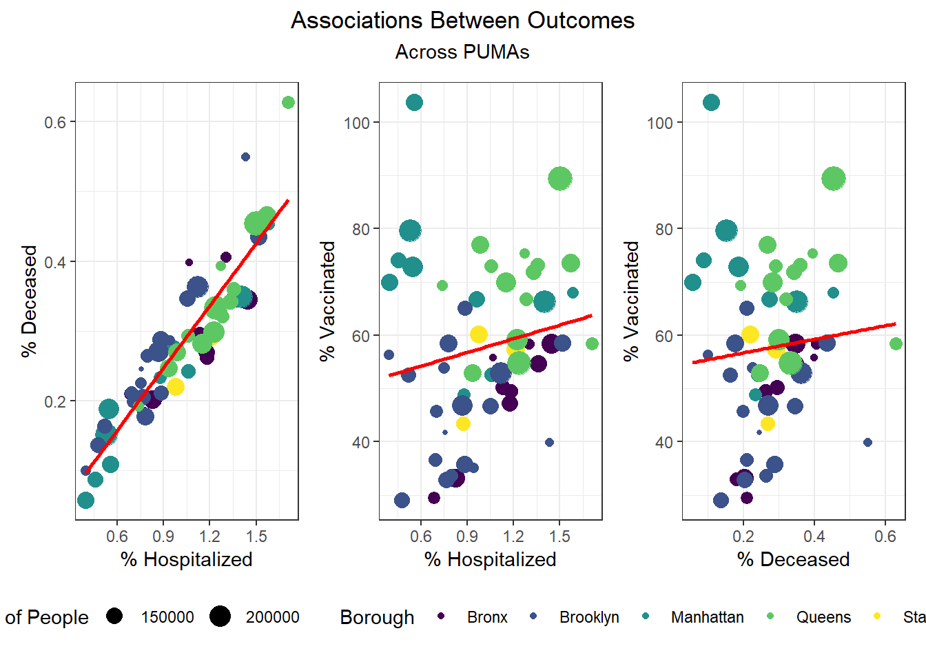
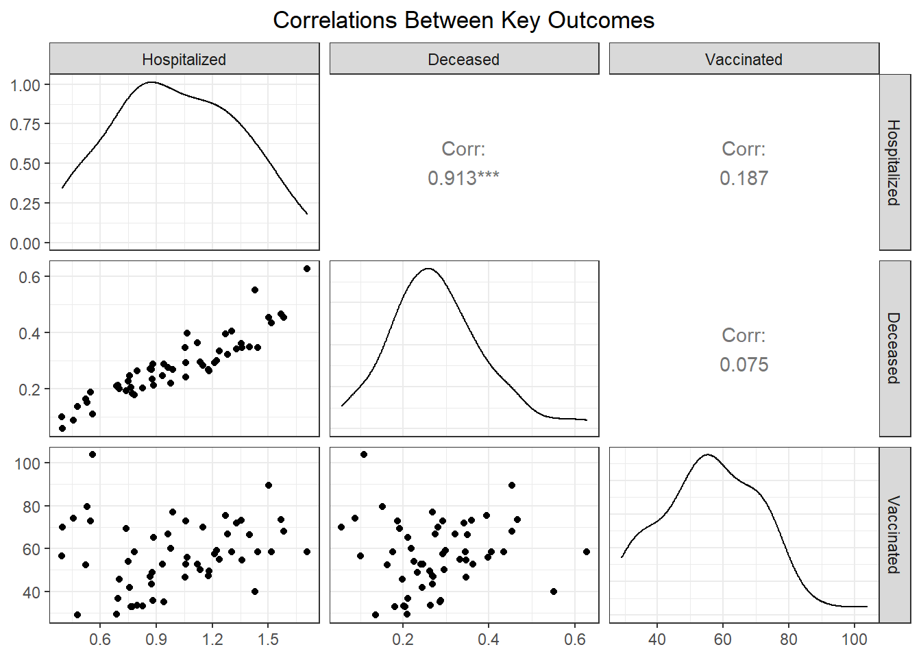
While our regression analysis more fully explores potential collinearity of our outcomes variables, we were interested how well hospitalizations, deaths, and vaccinations tracked each other at the PUMA level. Our findings show that across PUMAs in all boroughs, hospitalizations and deaths had a 0.913 correlation, which was highly statistically significant, whereas vaccination was not significantly correlated with either hospitalization or fatality.
# ggpairs correlations between key pairs, faceted by borough
puma_level_data %>%
  select(covid_hosp_rate, covid_death_rate, covid_vax_rate, borough) %>%
  mutate(
    covid_hosp_rate = covid_hosp_rate,
    covid_death_rate = covid_death_rate
  ) %>%
  rename(
    "Hospitalized" = covid_hosp_rate,
    "Deceased" = covid_death_rate,
    "Vaccinated" = covid_vax_rate,
    "Borough" = borough
  ) %>%
  ggpairs(
    title = "Correlations Between Key Outcomes",
    subtitle = "By Borough",
    ggplot2::aes(color = Borough, alpha = 0.3)
  ) +
  scale_fill_discrete() +
  theme(axis.text.x = element_text(angle = 90, vjust = 0.5, hjust=1))
Outcomes by Borough
Beyond exploring our data at the PUMA level, we were keen to understand trends at the borough level as well.
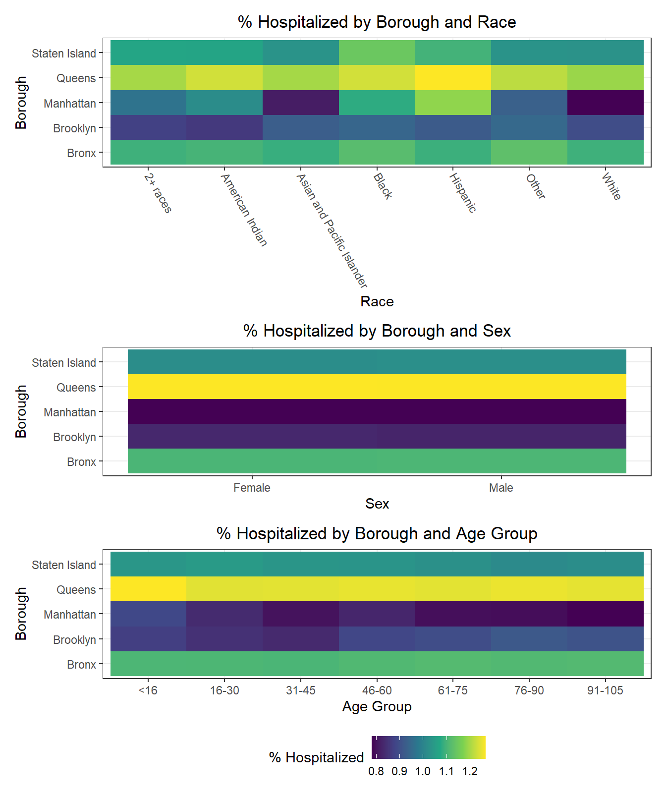
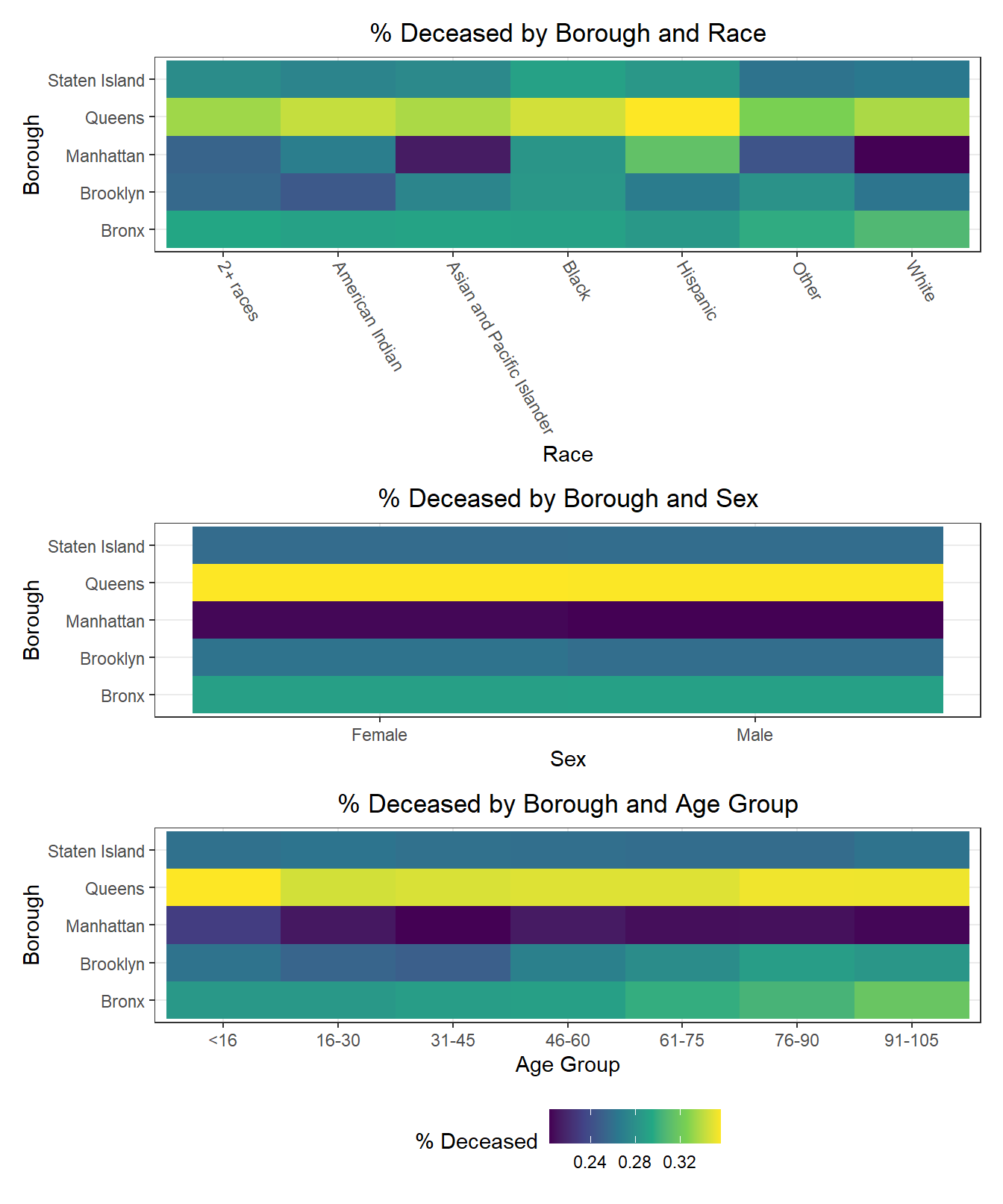
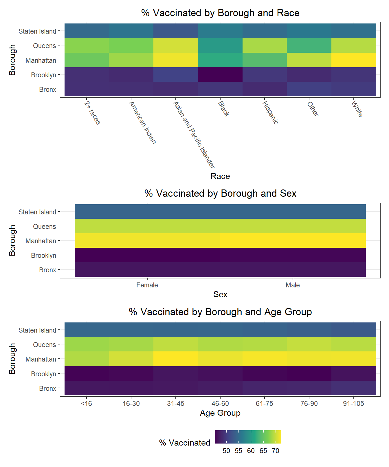
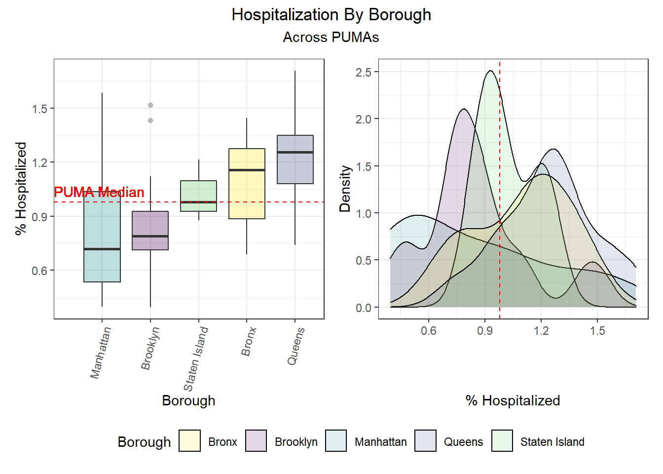
We can observe that hospitalization rates are generally more favorable in Manhattan and Brooklyn and less favorable in Queens and the Bronx. Similarly, death rates track hospitalization rates fairly well, with the best outcomes occurring in Manhattan and Brooklyn and the worst outcomes occurring largely in Queens. And unsurprisingly given the low correlation between vaccination and death or hospitalization by PUMA, we find that all of the top 10 vaccination rates occur in PUMAs found in Manhattan and Queens, whereas all of the bottom 10 vaccination rates occur in PUMAs found in the Bronx and Brooklyn.
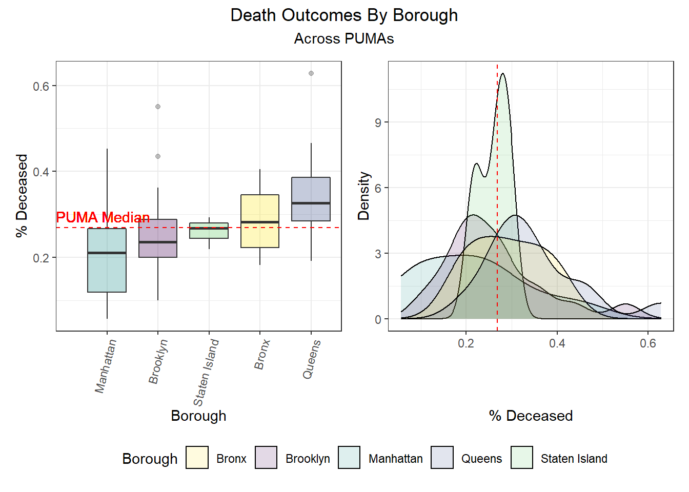
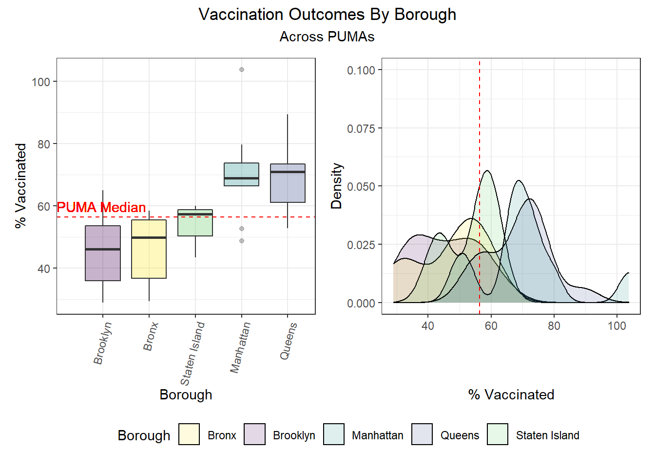
| Borough | Total PUMAs | % Above Hosp Median | % Above Death Median | % Above Vax Median |
|---|---|---|---|---|
| Bronx | 10 | 70.0 | 50.0 | 20.0 |
| Brooklyn | 18 | 22.2 | 38.9 | 16.7 |
| Manhattan | 10 | 30.0 | 30.0 | 80.0 |
| Queens | 14 | 85.7 | 78.6 | 85.7 |
| Staten Island | 3 | 33.3 | 33.3 | 66.7 |
Outcomes by Demographic Combinations
It’s quite common for individuals to self-identity according to a triplet of demographic variables: age, race, and sex. Epidemiological studies often use inclusion or exclusion criteria that explicitly restrict study populations to a subset of the overall population for each of these variables. As a result, we decided it would be interesting to explore how each uniquely-identified triplet (age, race, sex) performs on key COVID-19 outcomes. Generally, we find that hospitalization and death rates are lower among young white males and females, whereas vaccination rates are higher among Asian and Pacific Islanders across ages and sexes. Older American Indiain individuals, along with younger and middle-aged Black individuals, tended to have lower vaccination rates, while mixed race, American Indian, and “other” racial groups tended towards higher hospitalizations and fatalities as well.
# Lowest hospitalization rates
race_age_sex %>%
  filter(outcome == "hosp_rate") %>%
  mutate(
    outcome_rate = outcome_rate / 1000
  ) %>%
  arrange(outcome_rate) %>%
  select(race, age_class, sex, outcome_rate) %>%
  head() %>%
  knitr::kable(
    caption = "Lowest hospitalization rates",
    col.names = c("Race", "Age", "Sex", "% Hospitalized"),
    digits = 2
)| Race | Age | Sex | % Hospitalized |
|---|---|---|---|
| White | 21-30 | Female | 0.88 |
| White | 31-40 | Male | 0.89 |
| White | 31-40 | Female | 0.89 |
| White | 21-30 | Male | 0.90 |
| White | 41-50 | Male | 0.93 |
| White | 41-50 | Female | 0.93 |
# Highest hospitalization rates
race_age_sex %>%
  filter(outcome == "hosp_rate") %>%
  mutate(
    outcome_rate = outcome_rate / 1000
  ) %>%
  arrange(desc(outcome_rate)) %>%
  select(race, age_class, sex, outcome_rate) %>%
  head() %>%
  knitr::kable(
    caption = "Highest hospitalization rates",
    col.names = c("Race", "Age", "Sex", "% Hospitalized"),
    digits = 2
)| Race | Age | Sex | % Hospitalized |
|---|---|---|---|
| American Indian | 81-90 | Male | 1.27 |
| Other | 61-70 | Male | 1.22 |
| Other | 11-20 | Male | 1.21 |
| Other | 41-50 | Male | 1.20 |
| Other | 61-70 | Female | 1.19 |
| Asian and Pacific Islander | 91-100 | Male | 1.17 |
# Lowest death rates
race_age_sex %>%
  filter(outcome == "death_rate") %>%
  mutate(
    outcome_rate = outcome_rate / 1000
  ) %>%
  arrange(outcome_rate) %>%
  select(race, age_class, sex, outcome_rate) %>%
  head() %>%
  knitr::kable(
    caption = "Lowest death rates",
    col.names = c("Race", "Age", "Sex", "% Deceased"),
    digits = 2
)| Race | Age | Sex | % Deceased |
|---|---|---|---|
| White | 21-30 | Female | 0.24 |
| White | 31-40 | Male | 0.24 |
| White | 21-30 | Male | 0.24 |
| White | 31-40 | Female | 0.25 |
| Other | 81-90 | Male | 0.25 |
| White | 41-50 | Male | 0.26 |
# Highest death rates
race_age_sex %>%
  filter(outcome == "death_rate") %>%
  mutate(
    outcome_rate = outcome_rate / 1000
  ) %>%
  arrange(desc(outcome_rate)) %>%
  select(race, age_class, sex, outcome_rate) %>%
  head() %>%
  knitr::kable(
    caption = "Highest death rates",
    col.names = c("Race", "Age", "Sex", "% Deceased"),
    digits = 2
)| Race | Age | Sex | % Deceased |
|---|---|---|---|
| 2+ races | 91-100 | Male | 0.35 |
| Asian and Pacific Islander | 91-100 | Male | 0.34 |
| American Indian | 81-90 | Male | 0.32 |
| Other | 11-20 | Male | 0.32 |
| Other | 41-50 | Male | 0.32 |
| Other | 71-80 | Male | 0.32 |
# Lowest vax rates
race_age_sex %>%
  filter(outcome == "vax_rate") %>%
  mutate(
    outcome_rate = outcome_rate
  ) %>%
  arrange(outcome_rate) %>%
  select(race, age_class, sex, outcome_rate) %>%
  head() %>%
  knitr::kable(
    caption = "Lowest vaccination rates",
    col.names = c("Race", "Age", "Sex", "% Vaccinated"),
    digits = 2
)| Race | Age | Sex | % Vaccinated |
|---|---|---|---|
| American Indian | 71-80 | Male | 49.32 |
| Black | 11-20 | Female | 49.35 |
| Black | <11 | Male | 49.48 |
| Black | 11-20 | Male | 49.48 |
| Black | 31-40 | Female | 49.49 |
| Black | <11 | Female | 49.52 |
# Highest vax rates
race_age_sex %>%
  filter(outcome == "vax_rate") %>%
  mutate(
    outcome_rate = outcome_rate
  ) %>%
  arrange(desc(outcome_rate)) %>%
  select(race, age_class, sex, outcome_rate) %>%
  head() %>%
  knitr::kable(
    caption = "Highest vaccination rates",
    col.names = c("Race", "Age", "Sex", "% Vaccinated"),
    digits = 2
)| Race | Age | Sex | % Vaccinated |
|---|---|---|---|
| Asian and Pacific Islander | 91-100 | Female | 66.14 |
| Asian and Pacific Islander | 71-80 | Female | 65.90 |
| Asian and Pacific Islander | 71-80 | Male | 65.73 |
| Asian and Pacific Islander | 31-40 | Male | 65.62 |
| Asian and Pacific Islander | 31-40 | Female | 65.58 |
| 2+ races | 81-90 | Male | 65.48 |
Associations between Predictors and Outcomes
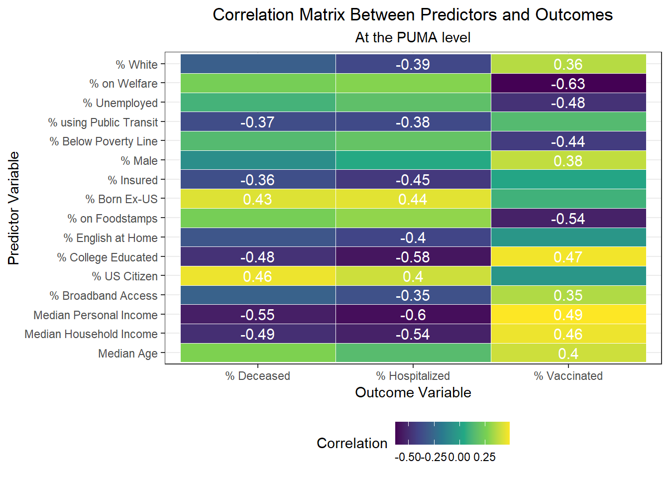
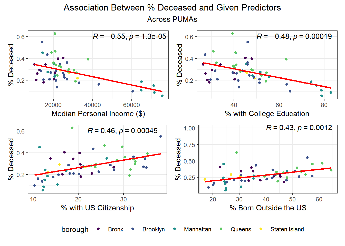
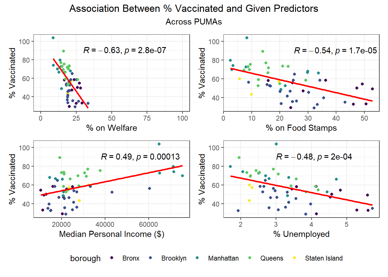
After exploring our outcomes geospatially (across PUMAs and boroughs), as well as on key demographic combinations, we turned towards our larger set of predictors from the census data to determine which, at the PUMA level, were significantly associated with our outcomes at the p < 0.01 significance level.
In the correlation matrix below, we include correlation scores only for those correlations that are highly statistically significant.
Correlates of worse outcomes
- Variables highly correlated with more hospitalizations: % US citizenship, % foreign born
- Variables highly correlated with more deaths: % US citizenship, % foreign born
- Variables highly correlated with fewer vaccinations: % on welfare, % unemployed, % below poverty line, % on food stamps
Correlates of better outcomes
- Variables highly correlated with fewer hospitalizations: % white, % using public transit to get to work, % with health insurance, % speaking English at home, % with college education, % with broadband access, median personal/household income
- Variables highly correlated with fewer deaths: % using public transit to get to work, % with health insurance, % college educated, median personal/household income
- Variables highly correlated with more vaccinations: % white, % male, % college educated, % with broadband access, median age, and median personal/household income
Income seems strongly associated with all three COVID-19 outcome variables across PUMAs, which resonates with prior analysis showing that income levels and income inequality are highly predictive of COVID deaths, among other outcomes.
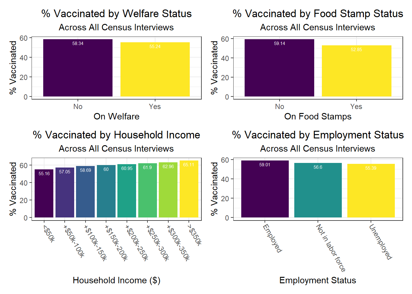
Another interesting finding is that signifiers of poverty – food stamp use, welfare use, and unemployment, for example – tend to be more associated with vaccination than with outcomes of transmission, like hospitalization or death. This is a fascinating indicator that vaccination, which may be considered a more “active” outcome than the other two – since it requires one to take an action on their own volition or motivation – may be more associated with structural inequality compared to more “passive” transmission.
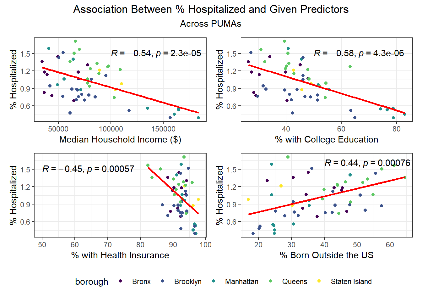
We then selected each of the four variables with highest correlation (positive or negative) for each outcome, excluding obvious redundancies (like personal income and household income), and explored specific association trends between predictor and outcome, colored by borough. The following graphs explore the variation across PUMAs on each major predictor vs. outcome, colored by borough.
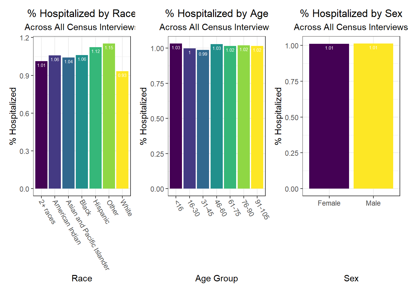
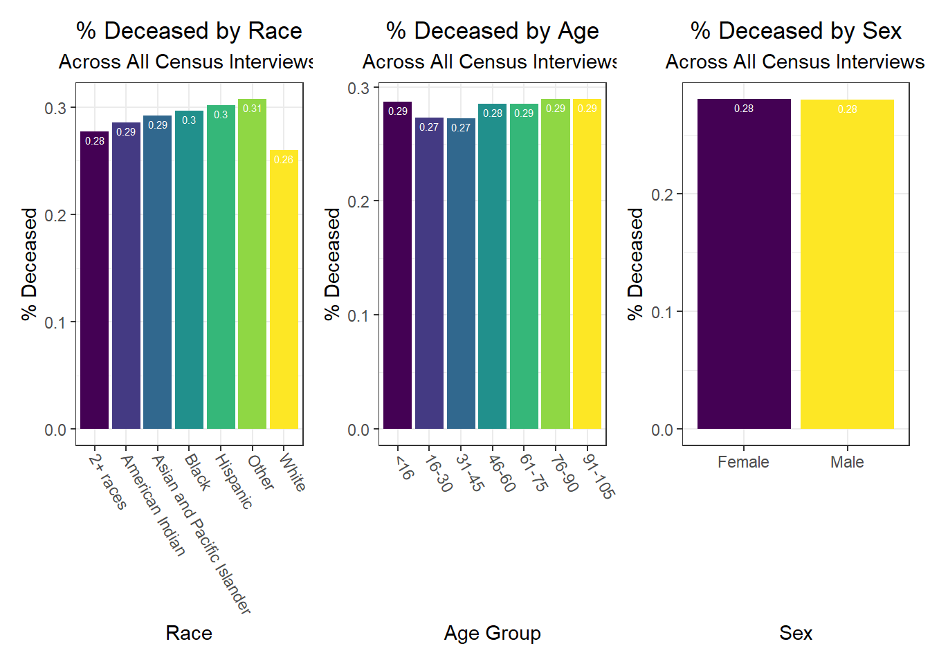
Beyond the predictors significantly associated with each outcome, we wanted to focus as well on how outcomes varied by levels of key socioeconomic variables – namely, race, age group, and sex. Because we lack individual outcome data (i.e. each census observation within a given PUMA has the same PUMA-level hospitalization, death, and vaccination rate), we assumed for this analysis that all persons in a given PUMA had equal likelihood of a particular outcome (hospitalization, death, or vaccination) being true, with the likelihood corresponding to the PUMA outcome rate.
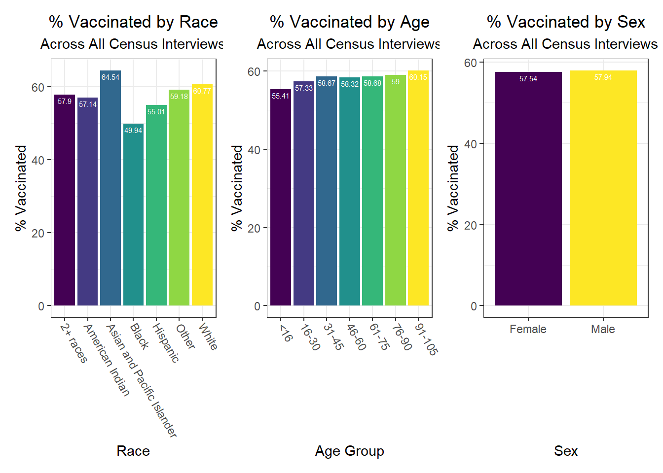
Below, we exclude some of the graphs for sex, since we found that males and females appear similar on each outcome. That said, we found older age groups tend to have higher hospitalization and death rates, but also higher vaccination rates. In general, white individuals also have a lower likelihood of hospitalization and death (matching the race-sex-age triplets we explored earlier), as well as a higher likelihood of vaccination (along with Asian and Pacific Islanders).
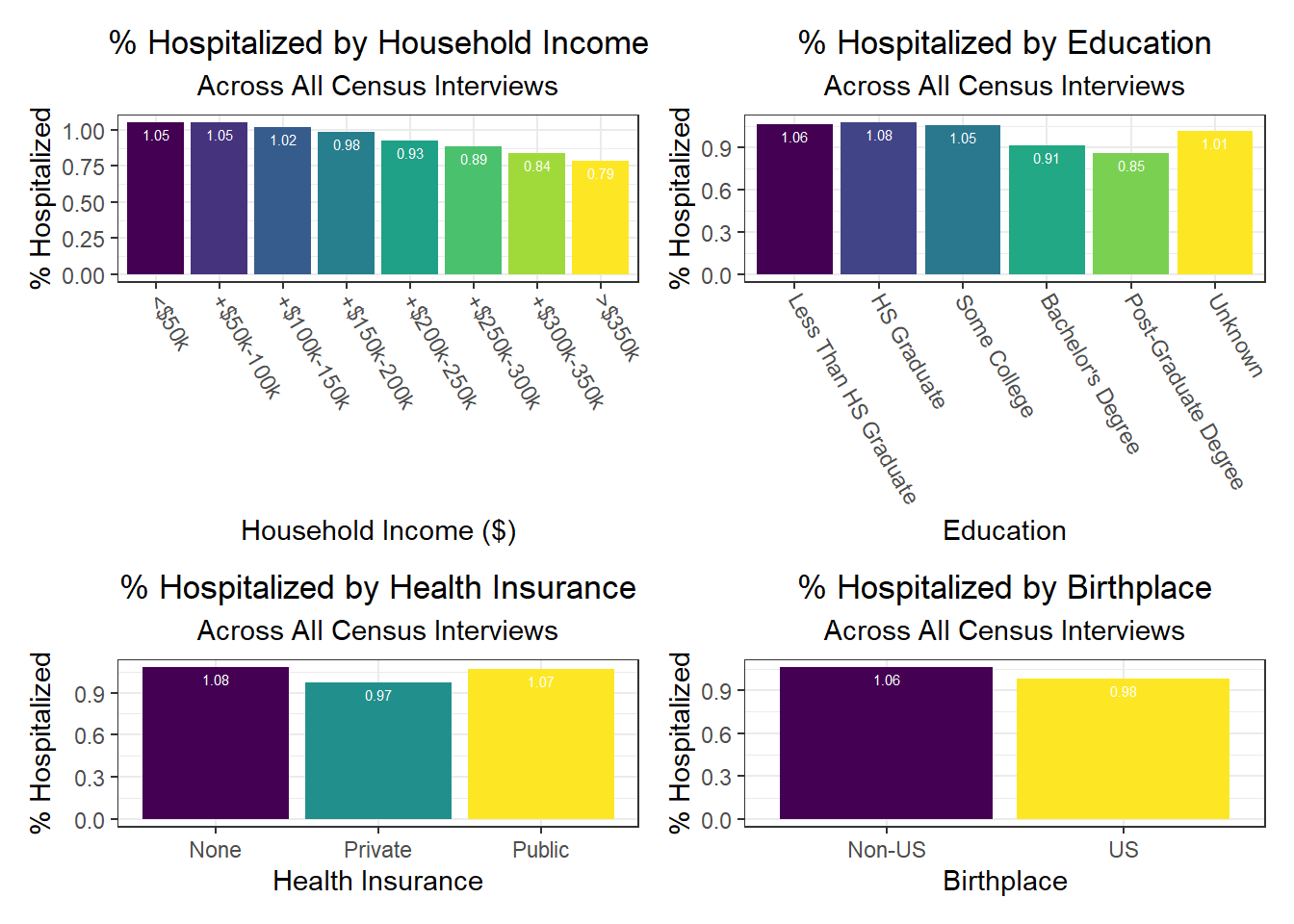
Similarly, we explored how key outcomes varied across categories of a few seemingly important predictor variables for each outcome observed in our correlation matrix. We found in the analysis below that all outcomes generally improve with higher income – again, confirming our correlation matrix findings. Education also generally appears protective of poor health outcomes from COVID-19. A couple of other interesting findings include:
- Individuals with public health insurance perform similarly to those with no insurance at all
- Individuals with unknown citizenship status tend to have lower death rates, which we hypothesize may be the result of under-reporting perhaps due to stigma and/or potential skepticism of city authorities that may result in US citizenship documentation issues

Associations between Predictors and Outcomes by Borough
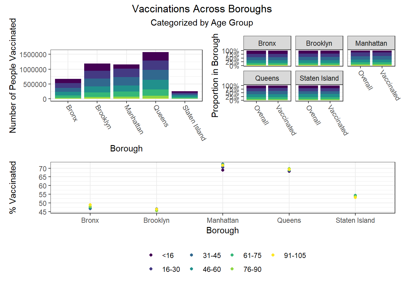
Finally, we were interested in observing disparities within boroughs. Each of the following visualizations has three panels: number of people with outcome, categorized by borough and colored by predictor level; % of people with outcome in each borough, colored by predictor level, compared to the overall composition of the borough by predictor level; and percent with outcome variable, in each borough, plotted by level of predictor.
One notable finding that became immediately clear to us is the Manhattan generally seems to be the most “unequal” borough when exploring how different demographic groups fare on key outcomes. For example, Manhattan has the greatest variation between racial groups on hospitalization and death rate, as well as between age groups on hospitalization rate, and too between racial groups and age groups on vaccination rate. Generally, Manhattan appears more unequal than other boroughs, which also tracks with the greater income inequality known to exist in Manhattan than in other NYC boroughs.
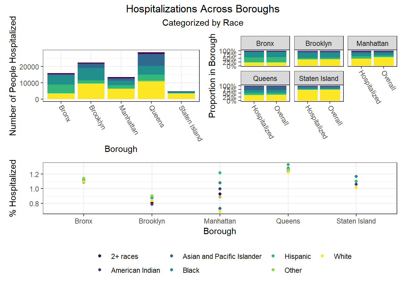
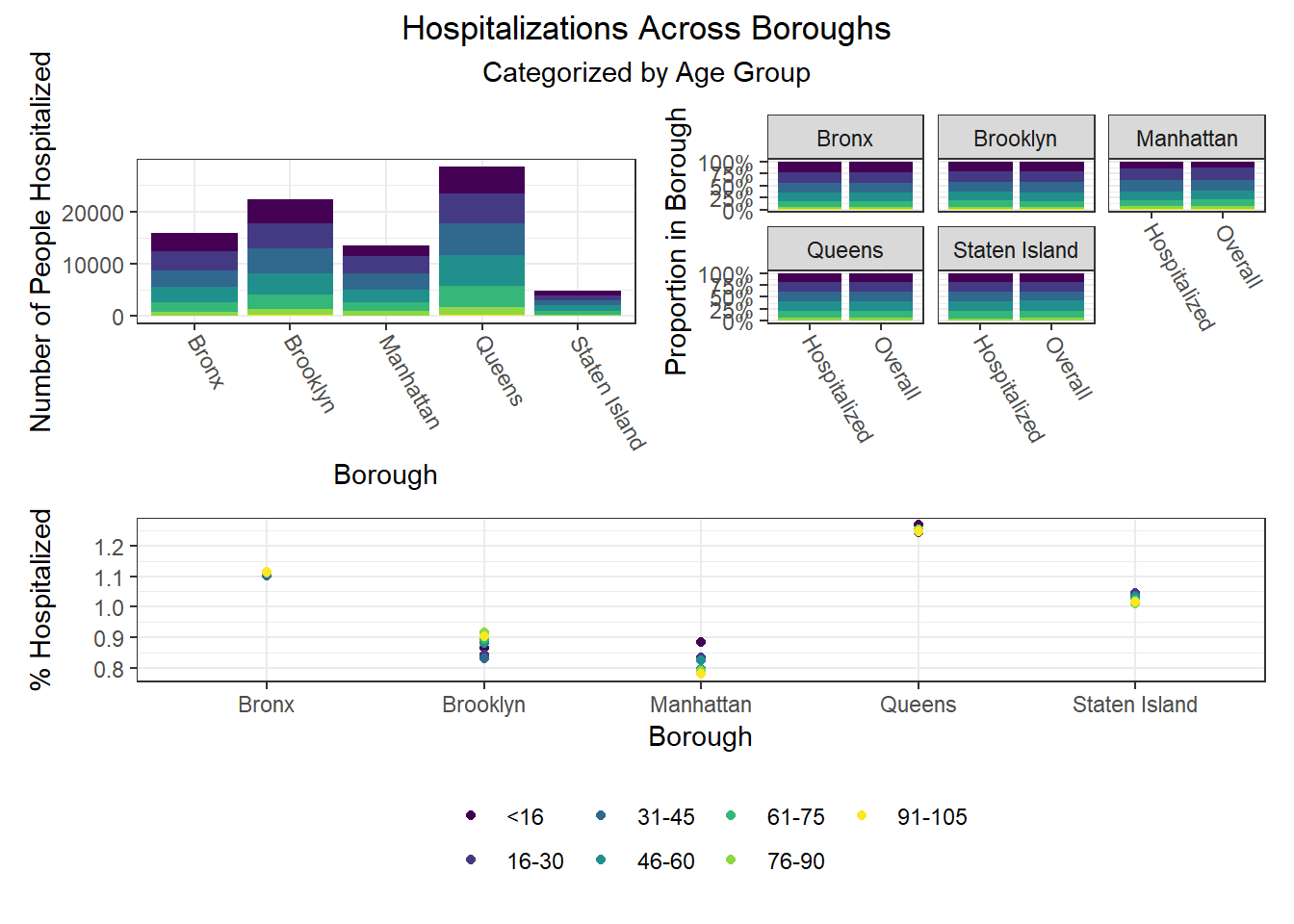
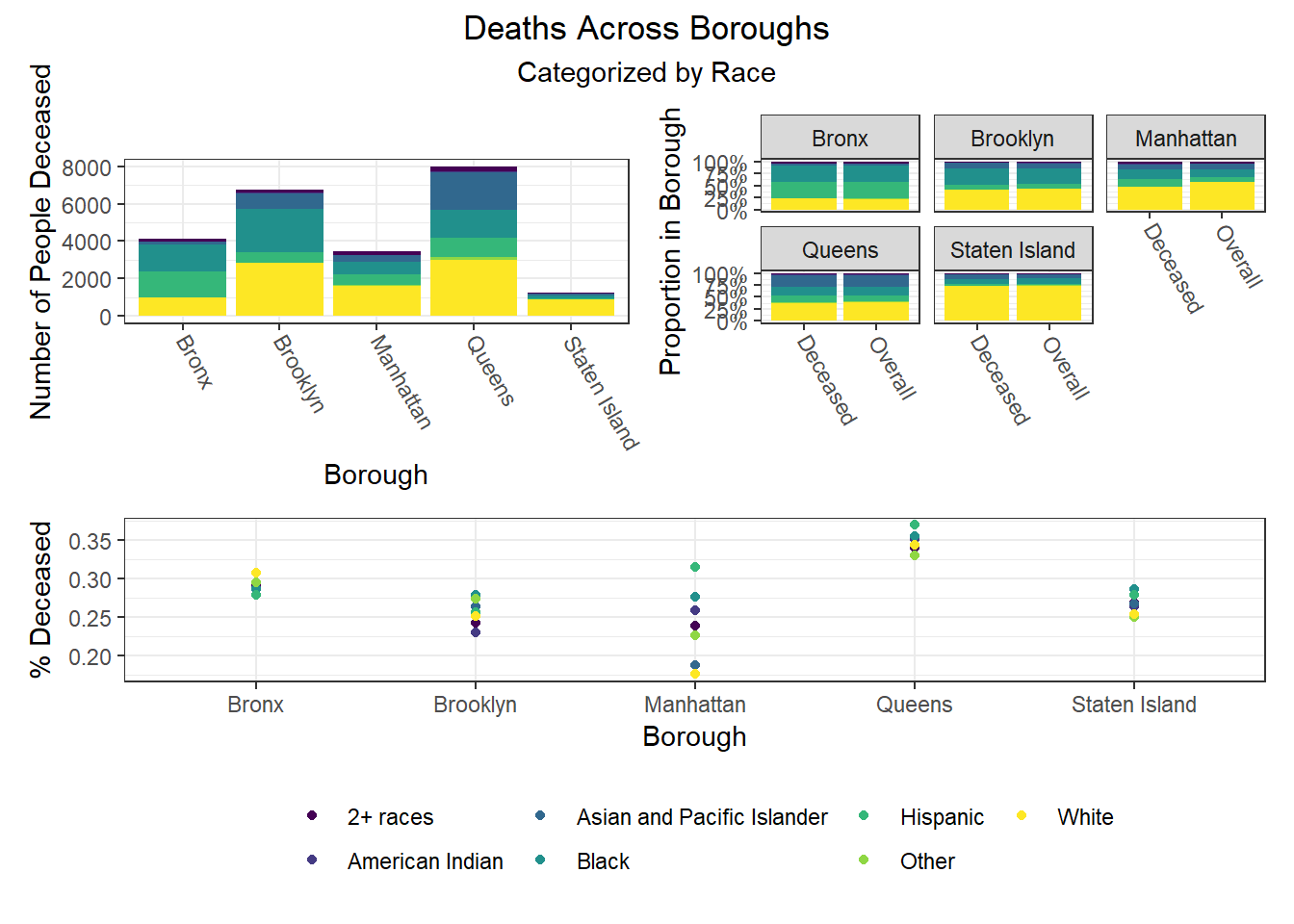
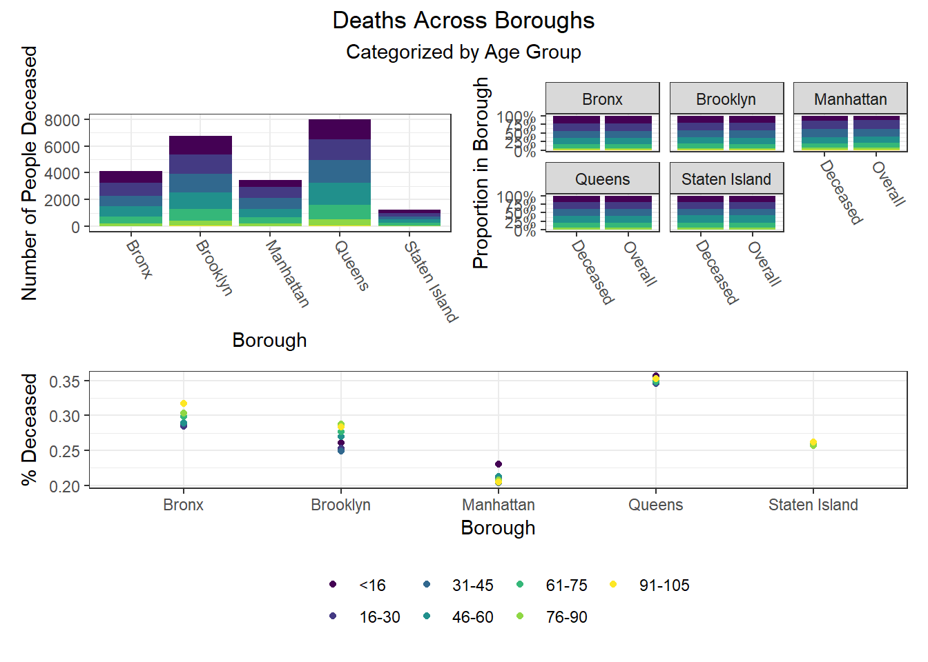
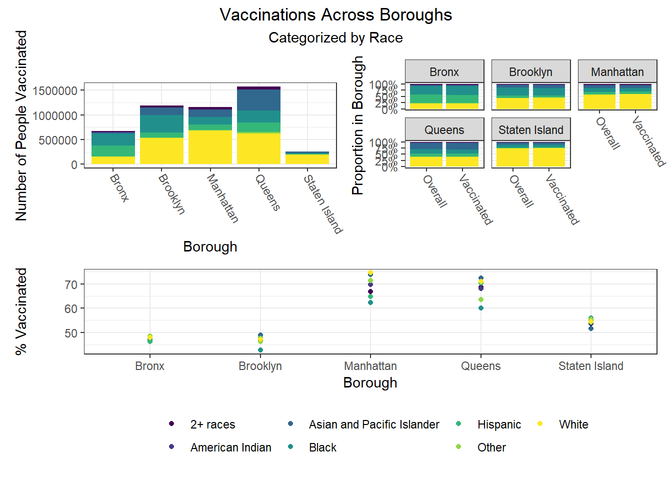
The following heatmaps similarly indicate such variations across PUMAs within a given borough, which appear more significant for race than for age and sex.